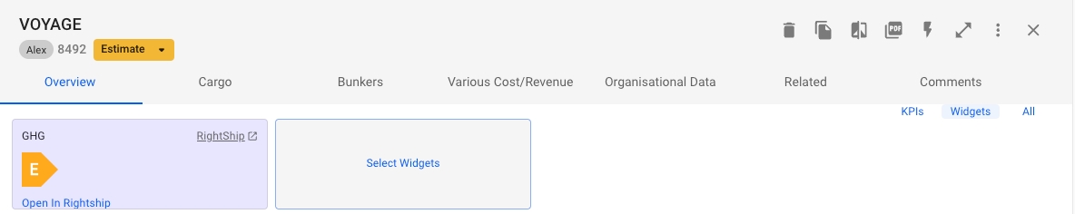
Widgets are components that allow you to integrate data from external APIs directly into Dataloy. These integrations must be configured by your system administrator before becoming available to users. Once configured, users can choose which widgets to display in their drawers based on their specific needs.
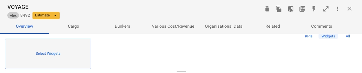
Navigate to any drawer
At the top of the drawer, you'll see three view options:
KPIs
Widgets
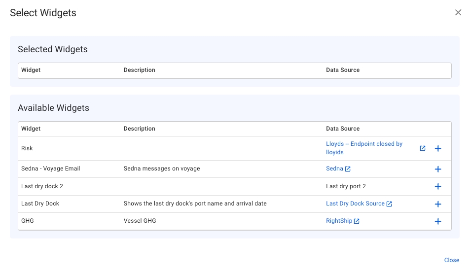
In the widget selection modal, you'll see:
Currently selected widgets (if any)
Available widgets list
To add a widget:
Browse the available widgets list
Click the (+) button next to any widget you want to add
The widget will be added to your drawer immediately
After selecting your widgets, they will appear in the drawer.
All
Choos All or Widgets
Click on "Select Widgets" to open the widget selection modal
Widgets in the VMS are dynamic components that seamlessly integrate with the system drawers. They provide real-time or updated information without opening dedicated applications or navigating multiple screens. By leveraging external APIs or data from the VMS itself, widgets offer you quick access to relevant information at a glance.
One of the key features of widgets is their flexibility in terms of customisation and the possibility to perform complex data extractions. The appearance and behaviour of widgets are highly customisable, including adjusting parameters such as font size, colour, layout, and content display.
To create a widget, go to Setup -> Widgets, and at the top right, click Create -> Create Widget.
In the "Contexts" step, choose a primary object type, like "Vessel". This object will be the source when querying data later. Contexts determine where widgets can be used. A widget can't be shown in a drawer without the context that links the widget's object type to the object in that location.
If a widget displays information about a vessel in the "voyage-drawer" context, the "object path" linking the voyage to the vessel would be vessel. This allows the widget to access vessel data in the voyage drawer.
Field names are displayed as column headers in a widget list, with values in rows. List field styles are fixed. In a widget card, field names act as labels followed by their values. Widget fields control how information is shown, either on a card or a list. You can customise the styles or use the defaults.
Ensuring that the "Value Data Type" matches the type of value in the data source is crucial for accurately displaying values.
To create a widget data source, go to Setup -> Widgets, and at the top right, click Create -> Create Widget Data Source.
A link to the "home page URL" address will be shown on the widget card. This is for reference only and doesn't affect data retrieval.
The "Widget" field connects the data source to a widget, and once selected cannot be changed unless the Widget is deleted.
The base URL and HTTP method form the starting point of the request's URL, with the parameterised URL template appended to it.
Widget data sources support various authentication methods, including username/password and token-based systems like OAuth 2.0.
After setting up the connection to the data source, you can customise data retrieval by adding parameters. These can be dynamically taken from the widget object or set as static values. Depending on your data source and request type, you can include these parameters in the URL path, request body, or HTTP headers. This flexibility allows for precise data fetching, fitting various scenarios and data source setups.
To create a dynamic filter value, enter a "Variable Name" and select an "Object Path". If the parameter type is set to "URL Parameter" or "Request Body", insert the variable placeholder into the template using the syntax {{variableName}}. When the widget loads, the placeholder will be replaced with the real value from the main object.
To populate your widgets with data from your source, use a JSONPath expression for each field that matches the desired data. Separate multiple JSONPaths with a semicolon (;) to combine results with a space.
To display multiple rows in a list widget, ensure the JSONPath result from your source is an array.
The JSONPath syntax supports powerful filtering and functions. For a more comprehensive understanding and examples of how JSONPath expressions are written, refer to the detailed examples in the official documentation.
date
Date-time formatted according to user locale
double
Decimal numbers
integer
Normal integers without decimals
link
URLs or email addresses become clickable links. Field name is used as label in card
string
Strings without formatting
$.fruit
"Apple"
$.color;$.fruit
"Red Apple"
[
    {
        "fruit": "Apple",
        "size": "Large",
        "color": "Red"
    },
    {
        "fruit": "Banana",
        "size": "Medium",
        "color": "Yellow"
    },
    {
        "fruit": "Grapes",
        "size": "Small",
        "color": "Purple"
    }
]{
"sizes": {
"Apple": "Large",
"Banana": "Medium",
"Grapes": "Small"
},
"colors": {
"Apple": "Red",
"Banana": "Yellow",
"Grapes": "Purple"
}
}[
{
"fruit": "Apple",
"size": "Large",
"color": "Red",
"price": 4
},
{
"fruit": "Banana",
"size": "Medium",
"color": "Yellow",
"price": 3
},
{
"fruit": "Strawberry",
"size": "Small",
"color": "Red",
"price": 8
}
]{
"fruit": "Apple",
"size": "Large",
"color": "Red"
}"Apple", "Banana", "Grapes"
$..size
"Large", "Medium", "Small"
$..color
"Red", "Yellow", "Purple"
$.sizes.*
"Large", "Medium", "Small"
$.colors.*
"Red", "Yellow", "Purple"
"Strawberry"